How to create interest in monochromatic images for food photography


Monochromatism is the use of just one colour in an image. It’s also used to refer to the use of just one colour plus a neutral shade (such as a white background).
This may sound a little… dare I say… boring? Flat? I promise you, when used in the right way, it is anything but boring and flat. Here are my favourite ways to add some flavour, some spice, some zing, to a monochromatic image. But don’t just stop at monochromatic images - these tips can be applied to non-monochromatic images too!
Layer different tints, shades, and tones
Just because you only use one colour doesn’t mean you’re restricted to one tint, shade, or tone! Tints, shades, and tones are just the colour with more white, black, or grey in it respectively. You can think of them as being just brighter, darker, or duller, or more vibrant versions of the same colour.
In the image below, you can see how the colour of the background, linen, and drink are layered and are of differing shades. Even the strawberries are sliced in half to add layers.

Similarly, with this image you can see different shades of brown. The cracked eggshells don’t just provide a storytelling element, they also show different shades of brown on the outside and the inside. The same goes for the chopped walnuts. As for layering in the scene and not just elements of the scene, you can see the darker surface beneath the lighter chopping board, which is layered with the darker chocolate and lighter nuts and shell.

Use highly contrasting shades or tints to create focus
Following from the previous tip, when you layer highly contrasting shades/ tints, it adds interest and helps your image pop, avoiding a flat image. This in particular also helps to create focus on your main subject so that it doesn’t get lost.
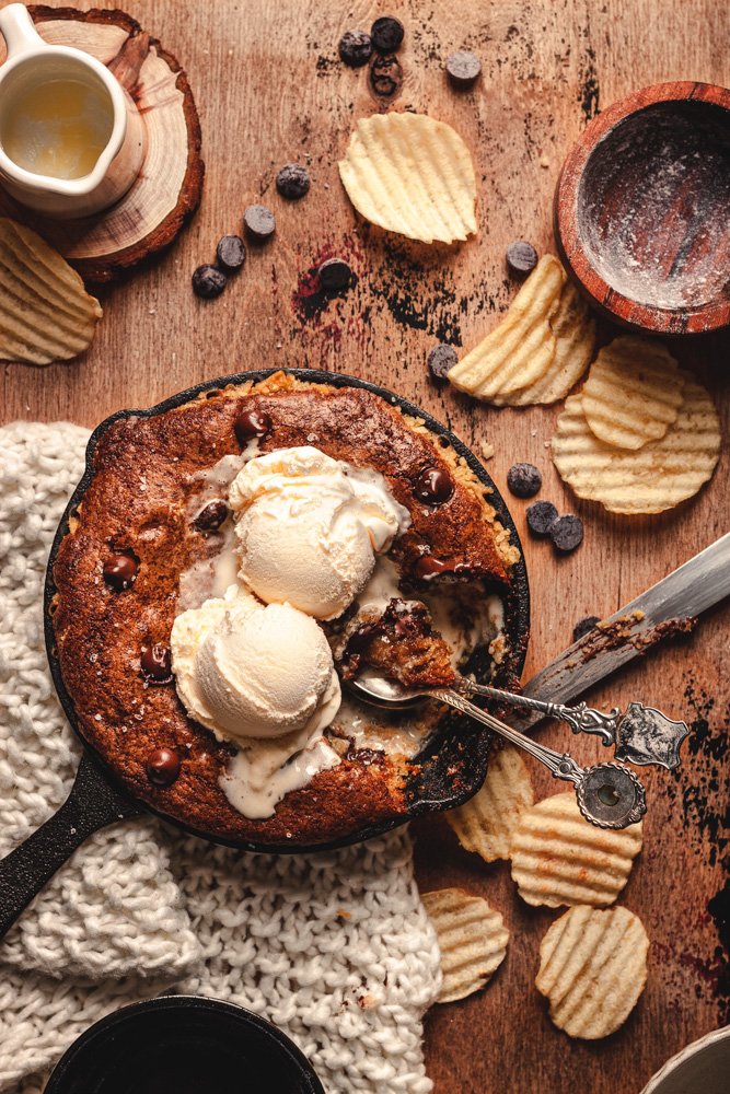
For example, in the image below, with the colour used being brown (which you can think of being a kind of orange or yellow), I layered my subject between the light coloured knit and ice cream.
Likewise, in this image, the box and surface are a similar shade, and the rolling pin, hands, and small coaster are similar. The flour and dumplings are brighter and lighter than everything else, hence creating contrast. This contrast leads the eye towards them.

Use differing textures
Similar to using a range of shades to create contrast and, therefore, interest and focus, using a range of textures also adds contrast and interest to an image.
In the image below, you can see the texture of the cup, the steam, the droplets, the ripples, the splash, and the still water. All these textures help to create a visually engaging image as well as add a kind of energy, which stops it feeling too flat or stagnant.

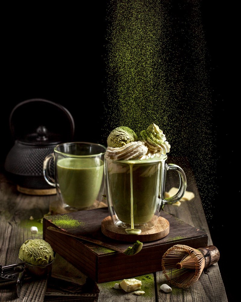
For this image (though technically not completely monochromatic), you can see the texture of the dusted matcha, the clumped matcha on the surface, the ice cream, the liquid, and the cream. You may think, ‘oh, it’s just the matcha action that does the job,’ but imagine there was no action. The texture of the ice cream vs. the cream vs. the liquid drip still creates interest. Imagine if the ice cream was more melted and you couldn’t see the texture, and imagine the whipped cream was only lightly whipped. The two textures would be so similar that they’d almost visually blend into the liquid.
Use light and shadows to create interest and add dimension
Shadows are super important in creating texture and adding dimension. It’s the reason why we don’t light our food from the front - there are no shadows and it makes the food look flat. Even light and airy photos have shadows.
In the image below, backlight was used to emphasise the texture of the whipped coffee and the texture of the milk. I even placed the spoon strategically in the beam of light shining between the two cups so that the light would catch the coffee in the spoon and highlight its texture. Texture is made more prominent with backlight as the shadows face the camera. For more in-depth information about how to use light, check out my guide!

For this image, backlight was also used to shine through the translucent banana chips, not just adding texture, but a different kind of texture to the opaque ganache and frosting. Look for opportunities to not only highlight texture, but differing types of textures (as per my previous tip!).

The below image uses harsh light to create texture through contrast (the streaks of light and shadow) and emphasis of the glow of the light through the orange slice. The harsh light also adds stronger highlights to the liquid, which adds to the contrast.

Play around with depth of field
Having a shallow depth of field can make an image feel more 3D, even when not talking about monochromatic images. However, making your image feel 3D is even more important with monochromatic images to help them avoid looking flat.
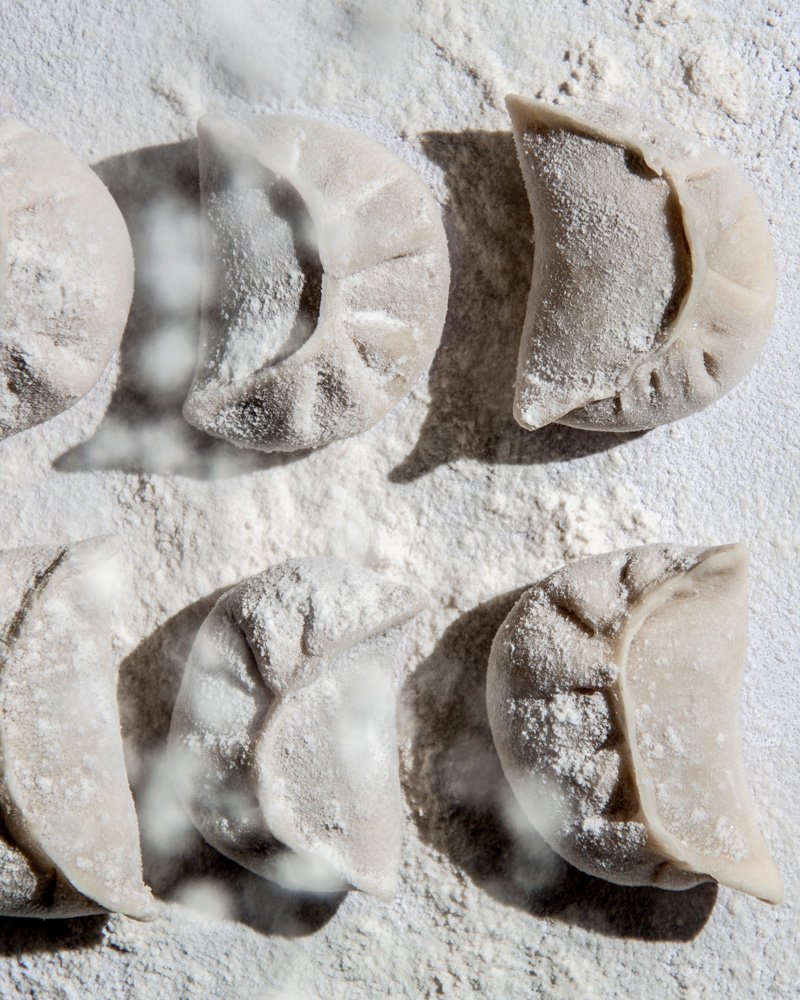
In the image below, you can see the blurry dusting of flour falling onto the dumplings. This creates interest as well as dimension.
The image below also has the shadow in the background interact with the main subject in the middle ground by essentially pointing towards it. This also helps to create depth and dimension.

Emphasise the meaning of the colour
This is more of a storytelling tip, but it can really tie it all in nicely in your image.
What I mean by ‘emphasise the meaning of the colour’, is to really lean into what message or feeling the colour gives off in context of your specific image. This can be done through things like lighting, editing, and prop choice. What do I mean by this?
Let’s revisit a couple of images previously shown in this post:
In the above image, the energy and boldness conveyed through the colour red is emphasised with the harsh light only slightly diffused, the drink glasses (storytelling), and the saturated colours. The red was also edited to be slightly magenta hued (pink-leaning), which emphasises the almost playful nature and light tone of the scene.
Let’s look at another example shown previously:

For this image, I wanted to emphasise the ‘natural’ feeling of the green. Wooden props were chosen to really drive that message home. I also chose to edit the greens to be a little more yellow hued. This tends to look like more of a natural green because yellow is found in nature whereas blue generally is not. The green was also not heavily saturated, again to add to the natural feel.

I want to stress that colour meaning is ALWAYS dependent on context, so these are not hard and fast rules. For more information on colour in food photography, check out my photography guide!
These are by no means the only ways to create interest in monochromatic images, but they’re my favourites, and so easy to incorporate into all your images, not just monochromatic ones.
Let me know if you found any of these tips helpful, or if you have your own favourite tip that’s not mentioned here!